|
THE AMBIGUITY DIAGRAM |
|
|
|
|
|
|
|
|
THE CW WAVEFORM:
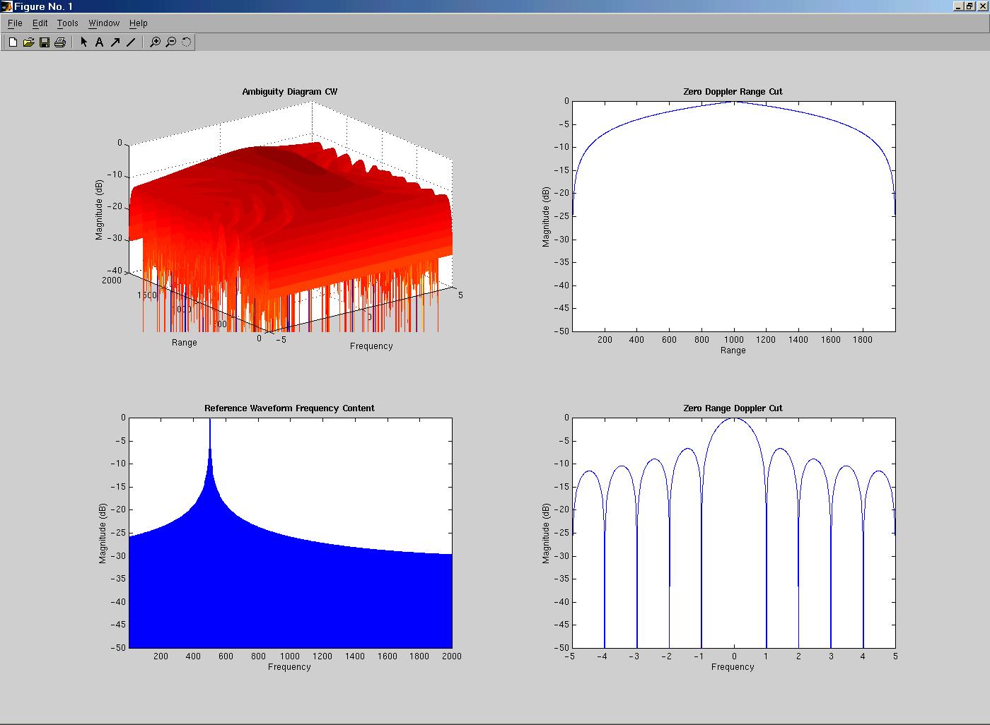
In the picture above we see 4 diagrams that convey information about the CW waveform. On the top left we see the Ambiguity diagram of the waveform. The two graphs on the right show zero Doppler and zero range cuts of the Ambiguity diagram. The zero Doppler cut is a cross-section of the Ambiguity diagram at frequency zero. The zero range cut is a cross-section at range zero. The bottom left diagram is the frequency content of the CW waveform. It is shifted to the right by 500 so you can see both positive and negative sides of the spectrum. A quick look at the Ambiguity diagram of the CW waveform shows us that, from the frequency point of view, the sides of the Ambiguity diagram fall of fairly quickly. This is more easily seen by looking at the bottom right graph. The side lobes of the frequency portion of this diagram fall off fairly quickly indicating that this CW waveform does a fairly accurate job of telling us how fast an object is traveling. However, if we now look at the range side of the Ambiguity diagram, we see that the sides of the graph fall off much more slowly. This is made more clear from the top right graph. The side lobes of this graph fall off fairly slowly indicating that it is hard to make a distinction between various ranges. For this reason the CW waveform does a poor job of telling us the exact location of an object in space. THE PCM WAVEFORM:
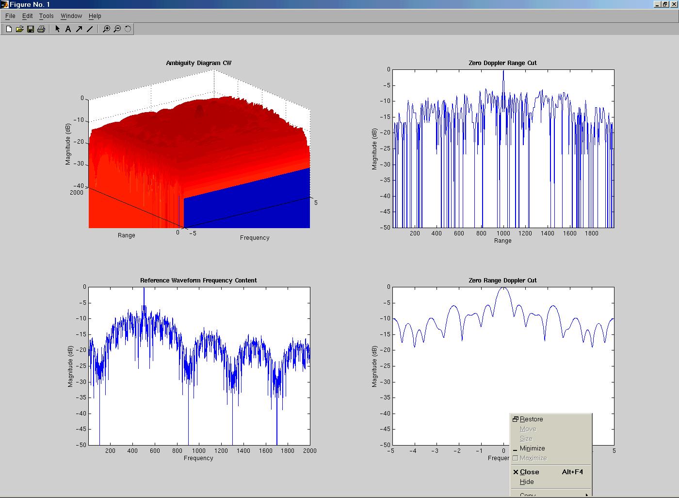
The Ambiguity diagram of the PCM waveform is a little tough to interpret, but by looking at the two graphs on the right, we can get a good idea of its properties. One should be able to see fairly easily that the properties of this graph are fairly similar to those of the CW waveform. First, by looking at the frequency portion of the diagram we can see that the side lobes of the graph are fairly low in comparison to the main lobe. Thus, just as in the case of the CW waveform, this waveform does a fairly decent job of telling us the speed of an object, though perhaps not quite as good a job as the CW waveform. Looking at the range portion of the diagram we see that things look kind of messy. This is due to the randomness of our waveform. However, ignoring all the jitters, we see that the range portion of this waveform is a good deal better than the range portion of the CW waveform. We see that there is a peak at range 1000, which falls off very quickly to either side. Magnitudes of the other ranges appear to stay around 10^-10 decibels. So this signal is a better range detector than the CW signal, though perhaps not quite good at detecting speed. Another advantage that this waveform possesses over the CW waveform is it’s random nature. In cases of national defense it would be quite difficult for an enemy plane to send some sort of jamming signal to our radar in order to make us think that is was somewhere else. On the other hand, this would be quite easy to do if our radar was transmitting a simple CW waveform. ^ back to top ^ |
MOTIVATION – Why this is important OBJECTIVE – What we hoped to achieve AMBIGUITY DIAGRAM - What it is AMBIGUITY DIAGRAM - How to read it WAVEFORMS – The signals we analyzed RESULTS – Results for CW and PCM CHIRP - A closer look POSSIBLE EXTENTIONS – What’s next CODE - Fascinating stuff ACKNOWLEDGMENTS - Who we have to thank |